- [CSS] CSS를 활용한 요소의 확장 기준점 제어하기2025년 06월 15일 23시 18분 37초에 업로드 된 글입니다.작성자: DandyNow728x90반응형
CSS를 활용한 요소의 확장 기준점 제어하기
1. 개요
웹 개발에서 동적으로 크기가 변하는 요소를 구현할 때, 확장의 기준점을 제어하는 것은 중요한 기술이다. 이 글에서는 CSS를 활용하여 요소가 왼쪽, 중앙, 오른쪽을 기준으로 확장되는 세 가지 방식을 구현하는 방법을 설명한다.
2. 핵심 개념
2.1 확장 기준점의 종류
- 왼쪽 기준 확장: 요소가 왼쪽을 기준으로 오른쪽으로 확장
- 중앙 기준 확장: 요소가 중앙을 기준으로 좌우로 동일하게 확장
- 오른쪽 기준 확장: 요소가 오른쪽을 기준으로 왼쪽으로 확장
2.2 사용된 주요 CSS 속성
position: 요소의 위치 지정 방식 결정display: 요소의 표시 방식 설정transform: 요소의 변형 적용justify-content: Flexbox 내 요소의 정렬 방식 지정
3. 구현 방법
3.1 왼쪽 기준 확장
.box {
  display: inline-block;
  min-width: 100px;
  margin: 0 auto;
  text-align: center;
}
display: inline-block으로 요소의 크기가 내용에 따라 자동으로 조절되도록 설정min-width로 최소 너비 지정margin: 0 auto와text-align: center로 시각적 중앙 정렬
3.2 중앙 기준 확장
.parent { position: relative; display: flex; justify-content: center; width: 100%; } .child { position: absolute; left: 50%; transform: translateX(-50%); min-width: 100px; text-align: center; whiteSpace: nowrap; }- 부모 요소에
position: relative와display: flex설정 - 자식 요소에
position: absolute와left: 50%로 중앙 위치 지정 transform: translateX(-50%)로 요소를 자신의 너비의 절반만큼 왼쪽으로 이동
3.3 오른쪽 기준 확장
.parent { position: relative; display: flex; justify-content: flex-end; width: 100%; } .child { display: inline-block; min-width: 100px; text-align: center; }- 부모 요소에
position: relative와display: flex설정 justify-content: flex-end로 자식 요소를 오른쪽 정렬
4. 실제 적용 예시
import { useState } from "react";

function CenterExpandTutorial() {
  const [text, setText] = useState("확장 기준점 튜토리얼");

  return (
    <div
      style={{
        padding: "20px",
        display: "flex",
        flexDirection: "column",
        gap: "20px",
        alignItems: "center",
      }}
    >
      <h2>확장 기준점 튜토리얼</h2>

      {/* 입력 필드 */}
      <input
        type="text"
        value={text}
        onChange={(e) => setText(e.target.value)}
        style={{
          padding: "8px",
          width: "200px",
          marginBottom: "20px",
        }}
      />

      {/* 왼쪽 기준 확장 박스 */}
      <div style={{ width: "100%" }}>
        <h3>1. 왼쪽 기준 확장 박스</h3>
        <div
          style={{
            backgroundColor: "#ff4444",
            color: "white",
            padding: "10px 20px",
            borderRadius: "20px",
            display: "inline-block",
            minWidth: "100px",
            margin: "0 auto",
            textAlign: "center",
            whiteSpace: "nowrap",
          }}
        >
          {text}
        </div>
      </div>

      {/* 중앙 기준 확장 박스 */}
      <div style={{ width: "100%" }}>
        <h3>2. 중앙 기준 확장 박스</h3>
        <div
          style={{
            position: "relative",
            display: "flex",
            justifyContent: "center",
            width: "100%",
          }}
        >
          <div
            style={{
              backgroundColor: "#4444ff",
              color: "white",
              padding: "10px 20px",
              borderRadius: "20px",
              display: "inline-block",
              minWidth: "100px",
              position: "absolute",
              left: "50%",
              transform: "translateX(-50%)",
              textAlign: "center",
              whiteSpace: "nowrap",
            }}
          >
            {text}
          </div>
        </div>
      </div>

      <br />

      {/* 오른쪽 기준 확장 박스 */}
      <div style={{ width: "100%" }}>
        <h3>3. 오른쪽 기준 확장 박스</h3>
        <div
          style={{
            position: "relative",
            display: "flex",
            justifyContent: "flex-end",
            width: "100%",
          }}
        >
          <div
            style={{
              backgroundColor: "#44ff44",
              color: "white",
              padding: "10px 20px",
              borderRadius: "20px",
              display: "inline-block",
              minWidth: "100px",
              textAlign: "center",
              whiteSpace: "nowrap",
            }}
          >
            {text}
          </div>
        </div>
      </div>
    </div>
  );
}

export default CenterExpandTutorial;
5. 주의사항
- 반응형 디자인 고려
- 모바일 환경에서의 동작 확인
- 최소/최대 너비 설정 검토
- 성능 최적화
transform속성 사용 시 GPU 가속 활용- 불필요한 리렌더링 방지
- 접근성
- 텍스트 가독성 확보
- 충분한 여백과 크기 설정
6. 결론
CSS의 다양한 속성을 활용하여 요소의 확장 기준점을 제어하는 방법을 살펴보았다. 각 방식은 특정 상황에 따라 적절히 선택하여 사용할 수 있으며, 이를 통해 더 유연하고 동적인 UI를 구현할 수 있다. 특히 중앙 기준 확장은 지도 마커나 툴팁과 같은 UI 요소에서 자주 사용되는 중요한 기술이다.

[그림1] 확장 전 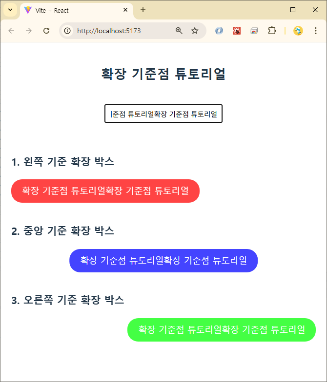
[그림2] 확장 후 728x90반응형'언어·프레임워크 > HTML·CSS' 카테고리의 다른 글
[HTML] `autocomplete` 속성: 웹 개발자가 알아야 할 모든 것 (2) 2025.06.27 [CSS] 선택자: 공백 하나로 의미가 달라지는 마법 (0) 2025.06.24 VS Code에서 Emmet 사용법 완벽 정리(HTML 및 CSS 코드 빠르게 작성하기) (0) 2025.04.22 [HTML] 여러 html로 페이지가 구성된 홈페이지에서의 라우팅 문제 (0) 2024.04.25 [CSS] 카카오 지도 커스텀-오버레이-마커의 앵커에 위경도 좌표 위치 시키기 (0) 2024.02.19 이전글이 없습니다.댓글